How to create a Website with HTML and CSS (step-by-step)
Do you want to learn how to create a whole website with HTML and CSS from scratch? In this post, we will create a website by first setting the site’s structure with HTML and then making it look good with CSS. This post will not give a detailed explanation of each styling we create, but we will have a closer look at the hero section. We will learn how to position elements and how to make the site responsive!
The website we will create
In this step-by-step guide, we will learn how to create the following website with HTML and CSS:
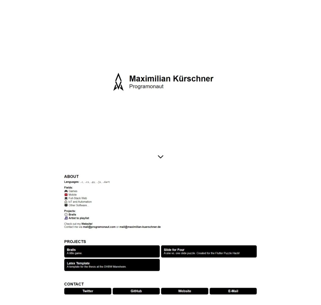
The website is one of the templates for Easy Portfolio, an automated Portfolio Generator that I created the last month!
What is HTML?
HTML is the basis of your website. It defines the structure and the different elements the website can hold. To accomplish this, HTML uses different elements. For example, you can use the image element to create an image on your website. The element consists of an opening tag, a closing tag, and different properties. For the image, the src property is used to define the location of the image. For example, the following image element will point to an image called “background.png” in the same directory as the HTML file:
<img src="./background.png">Of course, this is not everything you can do with HTML. To learn more about the HTML basics, check out this post here.
What is CSS?
On the other hand, CSS is used to style the different elements in your HTML. To style the correct elements you can use different selectors to target the correct elements. The most common ones are classes and ids. These are properties you can give every element. For example, we could set the size of the previous image by giving an id and then creating a style targeting that id:
<style>
#target-img {
    width: 100px;
    height: 100px;
}
</style>

<img id="target-img" src="./background.png">
As with HTML, this was only a super brief overview. To get a better understanding of CSS, check out this post here.
If this guide is helpful to you and you like what I do, please support me with a coffee!
Setting up the development environment for the website
For the following guide, I will use Visual Studio Code as my code editor. In there, we will create the HTML and CSS files. You can find VS Code here. Additionally, I suggest you install the VS Code extension Live Server, which allows for live updates of your website! Meaning every time we change our HTML or CSS, the website will automatically update and show the changes.
For the project structure itself, we will create a new directory with the project’s name. I will call it portfolio. In the new directory, we will create the file index.html that contains all the HTML we will write. In addition to the index.html we will also create two more directories. One is called assets, containing different a squared image called avatar.png, and the other is called css, containing a file called style.css that will hold all the CSS that we write.
In the end, the project structure should look like this:
portfolio
├── assets
│   └── avatar.png
├── css
│   └── style.css
└── index.html
Lastly, before we start. If you have any questions, do not hesitate to ask me through the chat window on the bottom right of the screen!
Create the Structure of the Website with HTML
So if we have a look at the website we want to create, we can see four sections. First is the hero section, containing my name, username, and the avatar image. Second, we have the about section containing a short description of myself. Third, we have a set of different projects that I worked on, and lastly, in the fourth section, we have different contact methods.
After seeing this, we can create the basic structure of the site. We create four divs holding the different sections and then different elements particular to each section. In addition to the different sections, we also include the file css/style.css inside of the HTML head!
<!DOCTYPE html>
<html lang="en">
  <head>
    <meta charset="UTF-8" />
    <link rel="icon" type="image/svg+xml" href="./assets/avatar.png" />
    <meta name="viewport" content="width=device-width, initial-scale=1.0" />
    <title>Portfolio</title>
    <link rel="stylesheet" href="./css/style.css" />
  </head>
  <body>
    <div>
      <div>
        <img src="./assets/avatar.png" alt="avatar" />
      </div>
      <div>
        <h1>Maximilian Kürschner</h1>
        <h2>Programonaut</h2>
      </div>
      <div>
        <svg xmlns="http://www.w3.org/2000/svg" fill="none" viewBox="0 0 24 24" stroke="currentColor" stroke-width="2">
          <path stroke-linecap="round" stroke-linejoin="round" d="M19 9l-7 7-7-7" />
        </svg>
      </div>
    </div>

    <div>
      <h2>ABOUT</h2>
      <div>
        <p>
          <strong>Languages:</strong> <code>.c</code>, <code>.cs</code>,
          <code>.py</code>, <code>.js</code>, <code>.dart</code>
        </p>
        <p>
          <strong>Fields:</strong> <br />
          🎮 Games <br />
          ☎️ Mobile <br />
          💻 Full-Stack Web <br />
          🏠 IoT and Automation <br />
          🖥️ Other Software…
        </p>
        <p>
          <strong>Projects:</strong> <br />
          🏐
          <a
            href="https://play.google.com/store/apps/details?id=com.Deved.Bralls"
            >Bralls</a
          >
          <br />
          🎵 <a href="https://playlist.programonaut.com/">Artist to playlist</a>
        </p>
        <p>
          Check out my
          <a href="https://programonaut.com"><strong>Website</strong></a
          >! <br />
          Contact me via <a href="mailto://mail@programonaut.com"><strong>mail@programonaut.com</strong></a> or
          <a href="mailto://mail@maximilian-kuerschner.de"><strong>mail@maximilian-kuerschner.de</strong></a>
        </p>
      </div>
    </div>

    <div>
      <h2>PROJECTS</h2>
      <div>
        <div>
          <h3>Bralls</h3>
          <p>A little game.</p>
        </div>
        <div>
          <h3>Slide for Four</h3>
          <p>
            A one vs. one slide puzzle. Created for the Flutter Puzzle Hack!
          </p>
        </div>
        <div>
          <h3>Latex Template</h3>
          <p>A template for the thesis at the DHBW Mannheim.</p>
        </div>
      </div>
    </div>

    <div>
      <h2>CONTACT</h2>
      <div>
        <div>Twitter</div>
        <div>GitHub</div>
        <div>Website</div>
        <div>E-Mail</div>
      </div>
    </div>
  </body>
</html>
With that, we now have the basic structure of the website. I already filled in all the content of the preview image. The next step is to add ids and classes to different elements. For the classes, we lookout for repeating elements so we can give them the same class. Some examples are the section titles, the project elements, etc.
<div id="hero-container">
  <div id="avatar-container">
    <img id="avatar" src="./assets/avatar.png" alt="avatar" />
  </div>
  <div id="profile-container">
    <h1 id="profile-name">Maximilian Kürschner</h1>
    <h2 id="profile-username">Programonaut</h2>
  </div>
  <div id="scroll-down">
    <svg xmlns="http://www.w3.org/2000/svg" fill="none" viewBox="0 0 24 24" stroke="currentColor" stroke-width="2">
      <path stroke-linecap="round" stroke-linejoin="round" d="M19 9l-7 7-7-7" />
    </svg>
  </div>
</div>

<div class="content-section">
  <h2 class="content-title">ABOUT</h2>
  <div id="about-text">
    <p>
      <strong>Languages:</strong> <code>.c</code>, <code>.cs</code>,
      <code>.py</code>, <code>.js</code>, <code>.dart</code>
    </p>
    <p>
      <strong>Fields:</strong> <br />
      🎮 Games <br />
      ☎️ Mobile <br />
      💻 Full-Stack Web <br />
      🏠 IoT and Automation <br />
      🖥️ Other Software…
    </p>
    <p>
      <strong>Projects:</strong> <br />
      🏐
      <a
        href="https://play.google.com/store/apps/details?id=com.Deved.Bralls"
        >Bralls</a
      >
      <br />
      🎵 <a href="https://playlist.programonaut.com/">Artist to playlist</a>
    </p>
    <p>
      Check out my
      <a href="https://programonaut.com"><strong>Website</strong></a
      >! <br />
      Contact me via <a href="mailto://mail@programonaut.com"><strong>mail@programonaut.com</strong></a> or
      <a href="mailto://mail@maximilian-kuerschner.de"><strong>mail@maximilian-kuerschner.de</strong></a>
    </p>
  </div>
</div>

<div class="content-section">
  <h2 class="content-title">PROJECTS</h2>
  <div id="projects">
    <div class="project-container">
      <h3 class="project-title">Bralls</h3>
      <p class="project-description">A little game.</p>
    </div>
    <div class="project-container">
      <h3 class="project-title">Slide for Four</h3>
      <p class="project-description">
        A one vs. one slide puzzle. Created for the Flutter Puzzle Hack!
      </p>
    </div>
    <div class="project-container">
      <h3 class="project-title">Latex Template</h3>
      <p class="project-description">A template for the thesis at the DHBW Mannheim.</p>
    </div>
  </div>
</div>

<div class="content-section">
  <h2 class="content-title">CONTACT</h2>
  <div id="contacts">
    <div class="contact">Twitter</div>
    <div class="contact">GitHub</div>
    <div class="contact">Website</div>
    <div class="contact">E-Mail</div>
  </div>
</div>
With that, we are finished working with our HTML, and we can head into the css/style.css file to make the website look good!
Style the Website with CSS
The next step is to apply styles to all the different elements, classes, and ids we defined in the previous step. I will not go into detail for every style. We will have a closer look at one example. For that, we will choose the hero section. In it, we have to use the following selectors for styling:
- #hero-container
- #avatar-container
- #avatar
- #profile-container
- #profile-name
- #profile-username
- #scroll-down
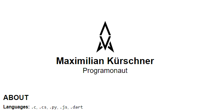
For the styling, we first think about what we want on mobile and what we want on the desktop. On mobile, we want the avatar image on top of the name and username. So the result should look something like this:
We can achieve that with the following styles. The important part is the #hero-container selector because it defines its contents to flow in a column. This is achieved with flexbox!
#hero-container {
display: flex;
flex-direction: column;
justify-content: center;
align-items: center;
margin: 4rem 1rem;
}
#avatar-container {
width: 128px;
height: 128px;
object-fit: contain;
}
#avatar {
width: 100%;
height: 100%;
}
#profile-container {
text-align: center;
}
#profile-name {
font-weight: bold;
margin: 0px;
}
#profile-username {
font-weight: lighter;
margin: 0px;
}
#scroll-down {
display: none;
position: absolute;
bottom: 1rem;
height: 48px;
width: 48px;
object-fit: contain;
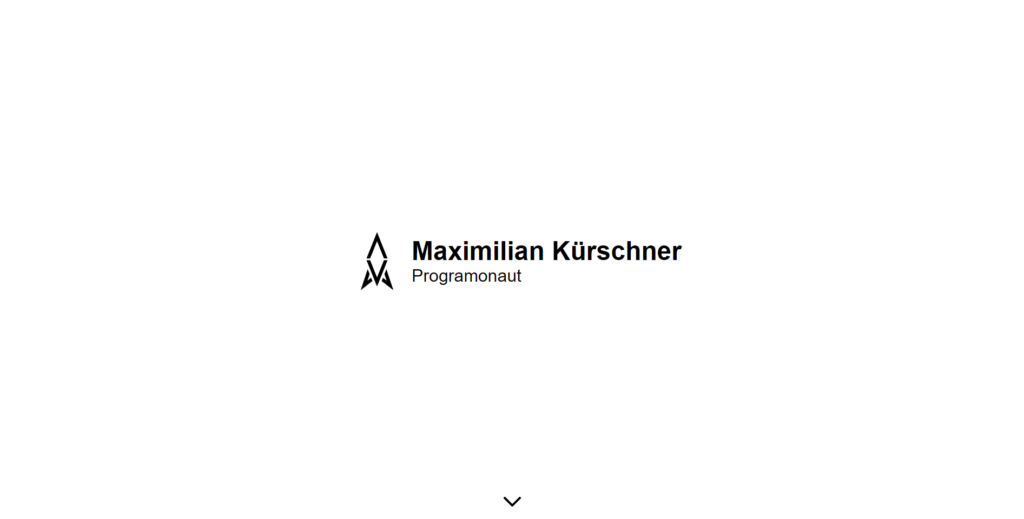
}On the desktop, we want this section to fill the whole screen, and we want the name and username beside the image instead of below it. So the result on the desktop should look like this:
Therefore we need to add the following styles if the media query is matched. Also, here we have to look at the #hero-container selector again. With it, we switch the content’s layout from flowing as a column to flowing as a row!
@media (min-width: 768px) {
    #hero-container {
        position: relative;
        height: 100vh;
        margin: 0;

        flex-direction: row;
    }

    #profile-name {
        font-size: 3rem;
    }

    #profile-username {
        font-size: 2rem;
        text-align: left;
    }

    #scroll-down {
        display: block;
    }
}
With that, we created a responsive hero section! From there, we can continue to style the rest of the website. The final CSS will look something like this:
body {
    margin: 0;
    font-family: sans-serif;
    font-size: 16px;
}

a {
    font-weight: bold;
    text-decoration: none;
    color: black;
}

a:hover {
    text-decoration: underline;
}

#hero-container {
    display: flex;
    flex-direction: column;
    justify-content: center;
    align-items: center;
    margin: 4rem 1rem;
}

#avatar-container {
    width: 128px;
    height: 128px;
    object-fit: contain;
}

#avatar {
    width: 100%;
    height: 100%;
}

#profile-container {
    text-align: center;
}

#profile-name {
    font-weight: bold;
    margin: 0px;
}

#profile-username {
    font-weight: lighter;
    margin: 0px;
}

#scroll-down {
    display: none;
    position: absolute;
    bottom: 1rem;
    height: 48px;
    width: 48px;
    object-fit: contain;
}

.content-section {
    margin: 4rem 1rem;
}

.content-title {
    margin-bottom: 0.5rem;
}

#about-text p:first-of-type {
    margin-top: 0;
}

#projects {
    display: grid;
    grid-template-columns: 1fr;
    grid-auto-rows: 1fr;
    gap: 0.5rem;
}

.project-container {
    background-color: black;
    border-radius: 0.5rem;
    color: white;

    padding: 1rem;
}

.project-title {
    font-weight: bold;
    margin: 0;
}

.project-container:hover .project-title {
    text-decoration: underline;
}

.project-description {
    margin: 0;
}

#contacts {
    display: grid;
    grid-template-columns: 1fr;
    grid-auto-rows: 1fr;
    gap: 0.5rem;
}

.contact {
    background-color: black;
    border-radius: 0.5rem;
    color: white;
    font-weight: bold;
    font-size: 1.25rem;
    text-align: center;

    padding: 0.5rem;
}

.contact:hover {
    text-decoration: underline;
}

@media (min-width: 768px) {
    #hero-container {
        position: relative;
        height: 100vh;
        margin: 0;

        flex-direction: row;
    }

    #profile-name {
        font-size: 3rem;
    }

    #profile-username {
        font-size: 2rem;
        text-align: left;
    }

    #scroll-down {
        display: block;
    }

    .content-section {
        width: 60%;
        margin-left: auto;
        margin-right: auto;
    }

    #projects {
        grid-template-columns: 0.5fr 0.5fr;
    }

    #contacts {
        grid-template-columns: 0.25fr 0.25fr 0.25fr 0.25fr;
    }
}
As said before, if there are any questions regarding the HTML or CSS, feel free to send me a message, and I will answer it as soon as possible!
Conclusion
In this post, we created a whole website with HTML and CSS from scratch. Therefore we first structured the site with different HTML elements and then styled them! For the styling itself, we had a closer look at the hero section instead of every single step.
You can find the whole project on GitHub.
I hope this post was helpful for you, and you are able to use this to create your own take on this website! Also, in case you liked it, consider subscribing to my newsletter to get monthly updates on the different posts that I created for you!
[convertkit form=2303042]
Discussion (0)
Related Posts