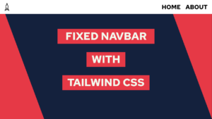
How to create a Website with HTML and Tailwind CSS (step-by-step)
Do you want to create a website with HTML and Tailwind CSS? In this post, we will do exactly that. First, we will start with setting up the project, and then we will set the site’s structure with HTML and style it with Tailwind CSS!
I would recommend you have a good understanding of CSS for this post. However, if you are just at the beginning of your journey, check out this post here. In it, we create the same website, but with basic CSS!
The Website we will create
We will create the following website with HTML and Tailwind CSS:
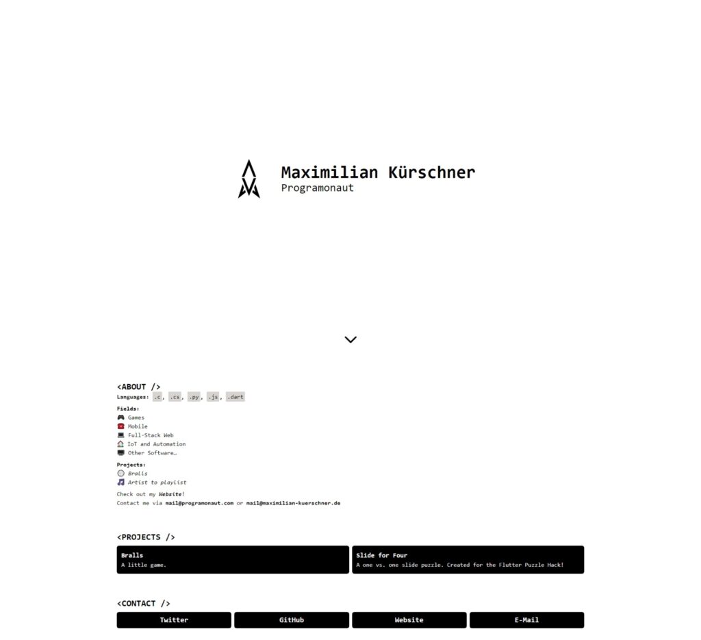
The website is one of the templates for Easy Portfolio, an automated Portfolio Generator that I created the last month!
What is Tailwind CSS?
Tailwind CSS is a framework that enables you to style your website directly in the HTML Markup. For that, it uses utility classes. For example, the class bg-black represents the CSS property background-color: black;.
Additionally, it will ease the process of creating good-looking and responsive websites by providing consistent sizing, consistent colors, and classes for breakpoints!
Check it out here!
If this guide is helpful to you and you like what I do, please support me with a coffee!
Set up the project
Setting up the project is not as easy as creating an HTML file and starting. But do not worry. I will now give you a step-by-step explanation of setting everything up properly.
I also created a script that I use to set up my projects. You can download that for subscribing to my newsletter 🙂
[convertkit form=3187272]
npm init vite portfoliocd portfolionpm inpm i -D tailwindcss postcss autoprefixernpx tailwindcss init -p- Open
tailwind.config.jsand update content to this:
module.exports = {
  content: [
    "./index.html"
  ],
  theme: {
    extend: {},
  },
  plugins: [],
}- Open
style.cssand update content to this:
@tailwind base;
@tailwind components;
@tailwind utilities;- Open
index.htmland update content to this:
<!DOCTYPE html>
<html lang="en">
  <head>
    <meta charset="UTF-8" />
    <link rel="icon" type="image/svg+xml" href="./favicon.svg" />
    <meta name="viewport" content="width=device-width, initial-scale=1.0" />
    <title>Portfolio</title>
    <link rel="stylesheet" href="./style.css">
  </head>
  <body>

  </body>
</html>
rm main.jsnpm run dev- Open http://localhost:3000 in your browser to see the site
With that, we set up Tailwind CSS. Now we will make some more changes that are project-specific. First, we create two folders. First, assets containing a file avatar.png, and second, css where we move style.css into. Lastly, we will update the contents of index.html to:
<!DOCTYPE html>
<html lang="en">
  <head>
    <meta charset="UTF-8" />
    <link rel="icon" type="image/svg+xml" href="./assets/avatar.png" />
    <meta name="viewport" content="width=device-width, initial-scale=1.0" />
    <title>Portfolio</title>
    <link rel="stylesheet" href="./css/style.css">
  </head>
  <body>

  </body>
</html>
With that, we have the following final structure:
portfolio
├── node_modules
├── assets
│   └── avatar.png
├── css
│   └── style.css
├── .gitignore
├── index.html
├── package.json
├── package-lock.json
├── postcss.config.js
└── tailwind.config.js
In case you used the script that you got by signing up for my newsletter, you only have to add the avata.png file to the assets folder and update the following line:
<link rel="icon" type="image/svg+xml" href="./favicon.svg" />to this:
<link rel="icon" type="image/svg+xml" href="./assets/avatar.png" />The rest is already handled for you.
Lastly, before we start, do not hesitate to ask me through the chat window on the bottom right of the screen if you have any questions!
Create the Structure of the Website with HTML
So if we have a look at the website we want to create, we can see four sections. First is the hero section, containing my name, username, and the avatar image. Second, we have the about section containing a short description of myself. Third, we have a set of different projects that I worked on, and lastly, in the fourth section, we have different contact methods.
Incorporating all of these results in the following contents for the index.html:
<!DOCTYPE html>
<html lang="en">
<head>
<meta charset="UTF-8" />
<link rel="icon" type="image/svg+xml" href="./assets/avatar.png" />
<meta name="viewport" content="width=device-width, initial-scale=1.0" />
<title>Portfolio</title>
<link rel="stylesheet" href="./css/style.css">
</head>
<body>
<div>
<img src="./assets/avatar.png" alt="avatar">
<div>
<h1>Maximilian Kürschner</h1>
<h2>Programonaut</h2>
</div>
<div>
<svg xmlns="http://www.w3.org/2000/svg" fill="none" viewBox="0 0 24 24" stroke="currentColor" stroke-width="2">
<path stroke-linecap="round" stroke-linejoin="round" d="M19 9l-7 7-7-7" />
</svg>
</div>
</div>
<div>
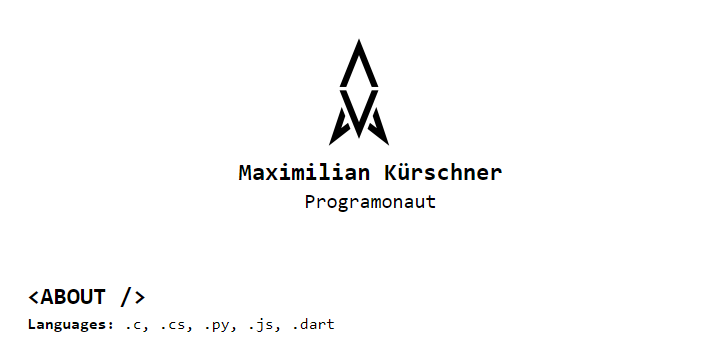
<h3><ABOUT /></h3>
<div>
<p>
<strong>Languages:</strong> <code>.c</code>, <code>.cs</code>,
<code>.py</code>, <code>.js</code>, <code>.dart</code>
</p>
<p>
<strong>Fields:</strong> <br />
🎮 Games <br />
☎️ Mobile <br />
💻 Full-Stack Web <br />
🏠 IoT and Automation <br />
🖥️ Other Software…
</p>
<p>
<strong>Projects:</strong> <br />
🏐
<a href="https://play.google.com/store/apps/details?id=com.Deved.Bralls">Bralls</a>
<br />
🎵 <a href="https://playlist.programonaut.com/">Artist to playlist</a>
</p>
<p>
Check out my
<a href="https://programonaut.com"><strong>Website</strong></a>! <br />
Contact me via <strong>mail@programonaut.com</strong> or
<strong>mail@maximilian-kuerschner.de</strong>
</p>
</div>
</div>
<div>
<h3><PROJECTS /></h3>
<div>
<div>
<h3>Bralls</h3>
<p>A little game.</p>
</div>
<div>
<h3>Slide for Four</h3>
<p>A one vs. one slide puzzle. Created for the Flutter Puzzle Hack!</p>
</div>
</div>
</div>
<div>
<h3><CONTACT /></h3>
<div>
<div>Twitter</div>
<div>GitHub</div>
<div>Website</div>
<div>E-Mail</div>
</div>
</div>
</body>
</html>With that, we now have the basic structure of the website. I already filled in all the content of the preview image.
Style the Website with Tailwind CSS
The next step is to add Tailwind CSS utility classes. I will not go over every part of the element site here; instead, I will focus on the hero section because it illustrates how to use Tailwind CSS pretty good.
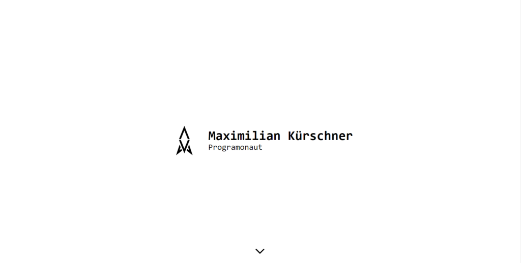
With Tailwind CSS, we follow a mobile-first approach to designing UIs. So, for the hero section, we want the mobile view looks like this:
As we can see in the image, the overall layout flows in a column. Therefore we will set the container to display flex and the flex direction as a column. This is represented through the utility classes flex and flex-col. We will also style other elements, but I think you should be able to get a basic understanding of that. So for the mobile view, the HTML will look like this:
<div class="flex flex-col justify-center items-center">
  <img class="w-32 h-32" src="./assets/avatar.png" alt="avatar">
  <div class="ml-6">
    <h1 class="text-2xl font-bold">Maximilian Kürschner</h1>
    <h2 class="text-xl text-center md:text-left">Programonaut</h2>
  </div>
  <div class="hidden absolute bottom-6 h-12 w-12">
    <svg xmlns="http://www.w3.org/2000/svg" fill="none" viewBox="0 0 24 24" stroke="currentColor" stroke-width="2">
      <path stroke-linecap="round" stroke-linejoin="round" d="M19 9l-7 7-7-7" />
    </svg>
  </div>
</div>
The Desktop view, on the other hand, should look like this:
As we can see, the hero section now covers the whole screen and flows as a row. To create this with Tailwind CSS, we will add the classes md:flex-row and md:h-screen. This will change the element’s style when the width of the screen is bigger than the breakpoint md.
<div class="flex flex-col justify-center items-center md:h-screen md:flex-row">
  <img class="w-32 h-32" src="./assets/avatar.png" alt="avatar">
  <div class="ml-6">
    <h1 class="text-2xl md:text-5xl font-bold">Maximilian Kürschner</h1>
    <h2 class="text-xl md:text-3xl text-center md:text-left">Programonaut</h2>
  </div>
  <div class="hidden absolute bottom-6 h-12 w-12 md:block">
    <svg xmlns="http://www.w3.org/2000/svg" fill="none" viewBox="0 0 24 24" stroke="currentColor" stroke-width="2">
      <path stroke-linecap="round" stroke-linejoin="round" d="M19 9l-7 7-7-7" />
    </svg>
  </div>
</div>
With that, we created a responsive hero section for our website.
The other parts of the site are styled in the same way. The final HTML will look something like this:
<!DOCTYPE html>
<html lang="en">
<head>
<meta charset="UTF-8" />
<link rel="icon" type="image/svg+xml" href="./assets/avatar.png" />
<meta name="viewport" content="width=device-width, initial-scale=1.0" />
<title>Portfolio</title>
<link rel="stylesheet" href="./css/style.css">
</head>
<body class="font-mono space-y-16 w-11/12 md:w-4/6 mx-auto my-8 md:mt-0">
<div class="flex flex-col justify-center items-center md:h-screen md:flex-row">
<img class="w-32 h-32" src="./assets/avatar.png" alt="avatar">
<div class="ml-6">
<h1 class="text-2xl md:text-5xl font-bold">Maximilian Kürschner</h1>
<h2 class="text-xl md:text-3xl text-center md:text-left">Programonaut</h2>
</div>
<div class="hidden absolute bottom-6 h-12 w-12 md:block">
<svg xmlns="http://www.w3.org/2000/svg" fill="none" viewBox="0 0 24 24" stroke="currentColor" stroke-width="2">
<path stroke-linecap="round" stroke-linejoin="round" d="M19 9l-7 7-7-7" />
</svg>
</div>
</div>
<div>
<h3 class="text-2xl font-bold"><ABOUT /></h3>
<div class="space-y-2">
<p>
<strong>Languages:</strong> <code>.c</code>, <code>.cs</code>,
<code>.py</code>, <code>.js</code>, <code>.dart</code>
</p>
<p>
<strong>Fields:</strong> <br />
🎮 Games <br />
☎️ Mobile <br />
💻 Full-Stack Web <br />
🏠 IoT and Automation <br />
🖥️ Other Software…
</p>
<p>
<strong>Projects:</strong> <br />
🏐
<a href="https://play.google.com/store/apps/details?id=com.Deved.Bralls">Bralls</a>
<br />
🎵 <a href="https://playlist.programonaut.com/">Artist to playlist</a>
</p>
<p>
Check out my
<a href="https://programonaut.com"><strong>Website</strong></a>! <br />
Contact me via <strong>mail@programonaut.com</strong> or
<strong>mail@maximilian-kuerschner.de</strong>
</p>
</div>
</div>
<div>
<h3 class="text-2xl font-bold mb-2"><PROJECTS /></h3>
<div class="grid grid-cols-1 auto-rows-fr gap-2 md:grid-cols-2">
<div class="bg-black text-white p-3 rounded-md group">
<h3 class="text-lg font-bold group-hover:underline">Bralls</h3>
<p>A little game.</p>
</div>
<div class="bg-black text-white p-3 rounded-md group">
<h3 class="text-lg font-bold group-hover:underline">Slide for Four</h3>
<p>A one vs. one slide puzzle. Created for the Flutter Puzzle Hack!</p>
</div>
</div>
</div>
<div>
<h3 class="text-2xl font-bold mb-2"><CONTACT /></h3>
<div class="grid grid-cols-1 gap-2 md:grid-cols-4">
<div class="bg-black text-white p-2 rounded-md text-center font-bold text-xl hover:underline">Twitter</div>
<div class="bg-black text-white p-2 rounded-md text-center font-bold text-xl hover:underline">GitHub</div>
<div class="bg-black text-white p-2 rounded-md text-center font-bold text-xl hover:underline">Website</div>
<div class="bg-black text-white p-2 rounded-md text-center font-bold text-xl hover:underline">E-Mail</div>
</div>
</div>
</body>
</html>Lastly, to add some general element style, we will update the contents of the css/style.css file as follows:
@tailwind base;
@tailwind components;
@tailwind utilities;

a {
    @apply italic;
}

a:hover {
    @apply underline decoration-black;
}

code {
    @apply bg-stone-300 p-1 rounded-sm;
}
Conclusion
In this post, we created a whole website with HTML and Tailwind CSS from scratch. Therefore we first structured the site with different HTML elements and then styled them with Tailwind! For the styling itself, we had a closer look at the hero section instead of every single step.
You can find the whole project on GitHub.
I hope this post was helpful for you, and you can use this to create your take on this website! Also, in case you liked it, consider subscribing to my newsletter to get monthly updates on the different posts that I created for you!
[convertkit form=2303042]
Discussion (0)
Related Posts