How does Flexbox work? An extremely useful and interactive guide
Are you asking yourself the question: How does flexbox work? Then you are in the right location. Because in this post, we will look at the basics of flexbox in an interactive and playful way!
We will first lay a theoretical foundation, and then you can play around with the available flexbox properties!
What is Flexbox?
Flexbox is a concept to define the layout of the elements on your page. One of the benefits is that it eases the process of creating responsive layouts.
Defining layouts is done with CSS and flexbox is an advanced concept in this area. In case you do not have knowledge in this area yet, check out the CSS basics first. I created a post covering the basics here.
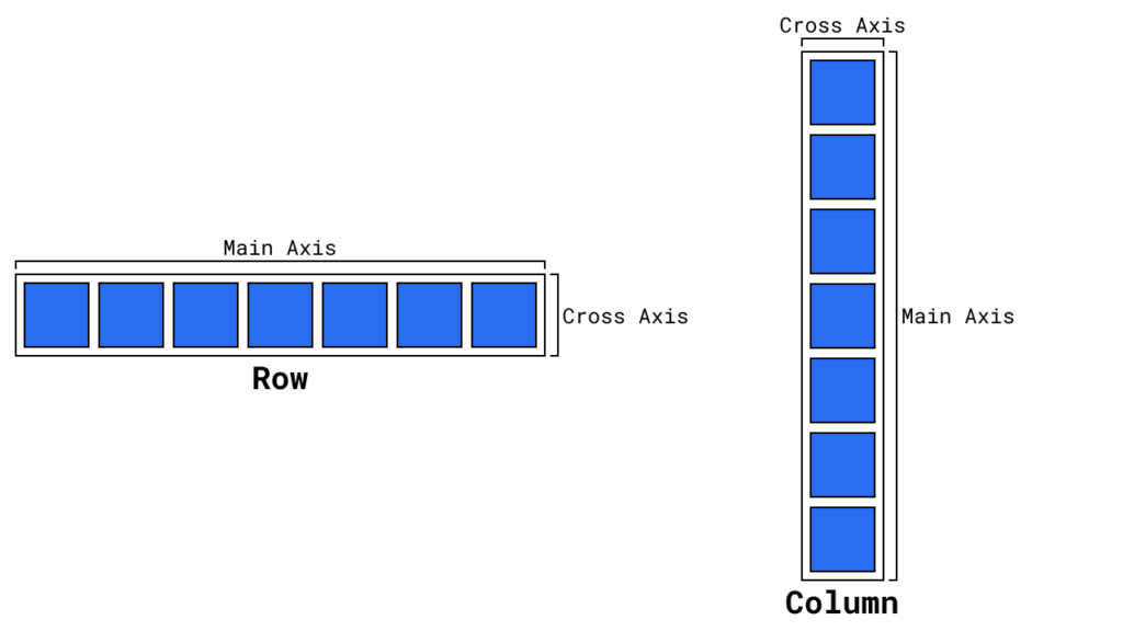
It works with columns and rows where the selected one refers to the main axis, and the other one is the cross axis. That is important information because you need it to define the layout and position of the elements. In the following image, you can see Rows and Columns with their axis.
How does Flexbox work?
You need to grasp one important concept before using flexbox to define the layout of your site. Flexbox works with multiple components:
- container: parent of the elements you want to layout
- children: elements that you want to manipulate with flexbox
The container is used to define the layout of its children. Thus every element you want to layout with flexbox has to be the children of a container. For example, you can define the container to spread out the children over its whole axis or align them on one side of the axis.
If this guide is helpful to you and you like what I do, please support me with a coffee!
Additionally, the children can define minor things, like their order or the space they can occupy.
In the next section, you will learn all the possible properties in an interactive way.
The Flexbox properties
First, we will have a look at the container properties and then we will have a look at children properties. I suggest you play around with the properties by selecting another option in the appropriate dropdown.
Container properties
display: flex
.container {
  display: flex; /* or inline-flex */
}
The display property defines the behavior of an element. In this case, you have to use flex to set the container and its children to use flexbox
flex-direction
.container {
  flex-direction: row | row-reverse | column | column-reverse;
}
flex-direction sets the main axis for the children. Possible values are:
- row (default): left to right in
ltr; right to left inrtl - row-reverse: right to left in
ltr; left to right inrtl - column: top to bottom
- column-reverse: bottom to top
For rows, the reading direction is important: rtl = right to left (e.g. English), ltr = left to right (e.g. Arabic)
flex-wrap
.container {
  flex-wrap: nowrap | wrap | wrap-reverse;
}
flex-wrap defines if children can automatically move to the next row/column:
- nowrap (default): all flex items will be on one line
- wrap: flex items will wrap from top to bottom over multiple lines
- wrap-reverse: flex items will wrap from bottom to top over multiple lines
flex-flow
.container {
  flex-flow: column wrap;
}
Shorthand for flex-direction and flex-wrap.
justify-content
.container {
  justify-content: flex-start | flex-end | center | space-between | space-around | space-evenly;
}
justify-content defines the alignment of the children along the main axis.
- flex-start (default): items align at the start of the main axis
- flex-end: items align at the end of the main axis
- center: items are centered along the line
- space-between: items are evenly distributed (x—x—x)
- space-around: items are evenly distributed with equal space around them. (-x–x–x-)
- space-evenly: items are evenly distributed with equal spacing between any two items and the edges (-x-x-x-)
align-items
.container {
  align-items: stretch | flex-start | flex-end | center | baseline;
}
align-items define the default behavior of the children along the cross axis.
- stretch (default): stretch to fill the container (still respect min-width/max-width)
- flex-start: items are placed at the start of the cross axis
- flex-end: items are placed at the end of the cross axis
- center: items are centered in the cross-axis
- baseline: items are aligned so that the basline aligns
gap, row-gap. column-gap
.container {
  gap: 10px;
  gap: 10px 20px; /* row-gap column gap */
  row-gap: 10px;
  column-gap: 20px;
}
The gap properties explicitly define the space between the children. It applies the gap only between each other and ignores the edges.
Children properties
order
.item {
  order: 5; /* default is 0 */
}
order modifies the default order of elements. To move it to a later position it the order property has to be higher.
flex-grow
.item {
  flex-grow: 4; /* default 0 */
}
flex-grow defines the ability of a child to grow if there is enough space available. It also defines the amount of free space it should take up.
flex-shrink
.item {
  flex-shrink: 3; /* default 1 */
}
The flex-shrink property defines the ability of a child to take up less space if necessary.
flex-basis
.item {
  flex-basis:  20%; /* default auto */
}
The flex-basis property defines the default size of an element before applying the shrink or the grow.
flex
.item {
  flex: none | [ <'flex-grow'> <'flex-shrink'>? || <'flex-basis'> ]
}
flex is the shorthand for flex-grow, flex-shrink, and flex-basis. It is recommended to use this over the single properties.
align-self
.item {
  align-self: auto | flex-start | flex-end | center | baseline | stretch;
}
align-self allows us to overwrite the default alignment (set by align-items) for individual children.
After playing around with the properties themselves you can also check out this post. It has really good visual representations of the different properties.
Conclusion
In this blog post, we first discussed the basics of flexbox, what it is and then we answered the question: how does flexbox work? Lastly, we had an interactive look at the properties and how they are used.
After playing around with the flexbox properties, I hope it is clearer how everything works. But the thing is… playing around, and reading is not the best way to learn it. So go ahead and jump into the depths of a project and use flexbox whenever suitable.
The next step to mastering CSS is to learn the basics of CSS Grid. In case you are interested check out this post.
In case you are interested in more Web Development related topics, consider subscribing to my newsletter!
[convertkit form=2303042]
Discussion (0)
Related Posts