How does CSS Grid work? An extremely useful and interactive guide!
Are you asking yourself the question: How does CSS Grid work? Then you are in the right spot. Because in this post, we will look at the basics of CSS Grid in an interactive and playful way!
We will first lay a theoretical foundation, and then play around with the available CSS Grid properties!
- What is CSS Grid?
- How does CSS Grid work?
- CSS Grid special units and functions
- The CSS Grid properties
- Conclusion
What is CSS Grid?
Like flexbox, CSS Grid is a concept to define layouts for your website. However, in contrast to flexbox, CSS Grid is based on two axes and used for grid-based layouts, as the name suggests.
CSS Grid completely changes the way you can define user interfaces. The reason for that is that it is the first module that was created specifically to solve layout problems you had with basic CSS.
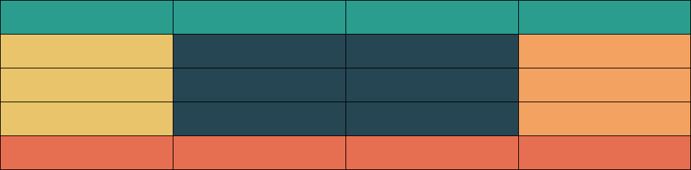
For a better understanding of the grid, you can imagine a table with different colors. In there you can define different areas in your layout that represent different parts of your website. For example the holy grail layout.
How does CSS Grid work?
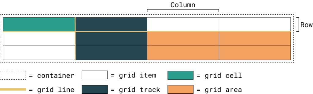
To better understand how CSS Grid works, we will look at six different terms first. The whole concept is based on these, and we will start with the main one. Like flexbox, covered in this post, each grid needs to be defined inside a container. The elements inside of the container are the grid-items (children). Both the container and the children have different CSS properties to define the layout.
Each child is part of a grid, and to define the layout itself and the position of the item, the following four terms are required. First, we have the grid lines. These represent the edges of rows and columns. Next, we have the cell, resembling one unit of the whole grid. You can also define it as the intersection between a row and a column.
If this guide is helpful to you and you like what I do, please support me with a coffee!
Next, we have the two terms defining multiple cells in a table. First is the grid-track. This term refers to all cells inside of a row or a column. And lastly, the grid-area has multiple cells in the form of a rectangle. This means that a grid-area is a collection of numerous cells surrounded by exactly four grid-lines. They can also span multiple rows and columns.
In the following image, you can see all six terms:
CSS Grid special unit and functions
The grid system introduced not only new properties but also a whole new style of defining your layout. Additionally, it introduced multiple new functions and a new unit.
The unit fr sets the size of a property to a fraction of the free space inside of a container. The available space is calculated with all static sizes in mind.
Additionally, we have two functions, first the repeat function. With this function, you can reduce the number of column definitions you have two write yourself. For example, you want to create four equally-sized columns. Normally it would look like this: 1fr 1fr 1fr 1fr, but with the function, you can do this: repeat(1fr, 4).
Lastly, we have the minmax function. This one sets the minimum and maximum size of a column or a similar property. So, for example, you can define an element with a minimum size of 400px and a maximum size of 50%: minmax(400px, 50%).
The CSS Grid properties
First, we will look at the container properties, and then we will look at the child properties. Finally, I suggest you play around with the properties by selecting another option in the appropriate dropdown. In this way, you learn interactively how CSS Grid does work!
Container properties
display
.container {
  display: flex; /* or inline-flex */
}
The display property defines the behavior of an element. In this case, you have to use a grid or inline-grid to set the container and its children to use CSS Grid.
grid-template-columns – grid-template-rows
.container {
  grid-template-columns: ...  ...;
  /* e.g.
      1fr 1fr
      minmax(10px, 1fr) 3fr
      repeat(5, 1fr)
      50px auto 100px 1fr
  */
  grid-template-rows: ... ...;
  /* e.g.
      min-content 1fr min-content
      100px 1fr max-content
  */
}
Both properties are used to define the rows and columns of the grid. The space-separated list of values represents the grid-track size.
You can also name the grid-lines by adding a name inside of square brackets like this:
grid-template-columns: [start] 1fr [split] 1fr [end];With this, you can reference grid-lines with a name instead of the index. That is something you have to keep in mind for different properties at a later point.
grid-template-areas
.container {
  grid-template-areas:
    "<grid-area-name> | . | none | ..."
    "...";
	/*
		"header header header header"
    "main main . sidebar"
    "footer footer footer footer";
	*/

}
grid-template-areas are used to define a layout by using named grid-areas. The grid-area is a property of a child and looks like this:
.item {
  grid-area: header;
}
The syntax of this property already visualizes the structure of the grid.
Options:
- <grid-area-name>: the name of a grid area
.: represents an empy cell- none: no grid areas are defined
grid-template
.container {
  grid-template: none | <grid-template-rows> / <grid-template-columns>;
}
With this shorthand, you can set the grid-template-columns, grid-template-rows, and the grid-template-areas in one property
column-gap, row-gap
.container {
  column-gap: <line-size>;
  row-gap: <line-size>;
}
Use these properties to define the grid-line size or better the gap between columns and rows.
gap
.container {
  gap: <grid-row-gap> <grid-column-gap>;
}
gap is the shorthand for both the column and the row gap
justify-items
.container {
  justify-items: start | end | center | stretch;
}
justify-items defines the positioning of the content inside of a grid-cell along the row axis. Possible values can be found in place-items.
align-items
.container {
  align-items: start | end | center | stretch;
}
align-items defines the positioning of the content inside of a grid-cell along the column axis. Possible values can be found in place-items.
place-items
.container {
  place-items: <align-items> <justify-items>;
}
place-item is the shorthand for align-items and justify-items. In case you only specify the align-items property, it is also assigned to the justify-items property. Possibly values for both properties are:
- stretch (default): fills the whole width of the cell
- start: aligns items to the start edge of their cell
- end: aligns items to the end edge of their cell
- center: aligns items in the center of their cell
justify-content
.container {
  justify-content: start | end | center | stretch | space-around | space-between | space-evenly;
}
This property is used when the actual grid size is smaller than the size of your grid container. It aligns the grid along the row axis similar to the behavior of justify-content in flexbox as discussed here. Possible values can be found in place-content.
align-content
.container {
  align-content: start | end | center | stretch | space-around | space-between | space-evenly;
}
This property is used when the actual grid size is smaller than the size of your grid container. It aligns the grid along the column axis similar to the behavior of justify-content in flexbox as discussed here. Possible values can be found in place-content.
place-content
.container {
  place-content: <align-content> <justify-content>;
}
place-content is the shorthand for align-content and justify-content. In case you only specify the align-content property, it is also assigned to the justify-content property. Possible values for both properties are:
- start: aligns the grid to the start edge of the grid container
- end: aligns the grid to the end edge of the grid container
- center: aligns the grid in the center of the grid container
- stretch : resizes the grid items to allow the grid to fill the full width of the grid container
- space-around: places an even amount of space between each grid item, with half-sized spaces on the far ends
- space-between: places an even amount of space between each grid item, with no space at the far ends
- space-evenly: places an even amount of space between each grid item, including the far ends
grid-auto-columns, grid-auto-rows
.container {
  grid-auto-columns: <track-size> ...;
  grid-auto-rows: <track-size> ...;
}
With these properties, you define the default size of new grid tracks.
grid-auto-flow
.container {
  grid-auto-flow: row | column | row dense | column dense;
}
grid-auto-flow defines the way placement of grid-items that you do not define explicitly. Possible values are:
- row (default): fills new items in a new row, adding new rows as necessary
- column: fills new items in a new column, adding new columns as necessary
grid
.container {
	grid: none, <grid-template>, <grid-template-rows> / [ auto-flow ] <grid-auto-columns>?, [ auto-flow ] <grid-auto-rows>? / <grid-template-columns>
}
grid is the shorthand for the following properties: grid-template-rows, grid-template-columns, grid-template-areas, grid-auto-rows, grid-auto-columns, grid-auto-flow
Children properties
grid-column-start, grid-column-end, grid-row-start, grid-row-end
.item {
  grid-column-start: <number> | <name> | span <number> | span <name> | auto;
  grid-column-end: <number> | <name> | span <number> | span <name> | auto;
  grid-row-start: <number> | <name> | span <number> | span <name> | auto;
  grid-row-end: <number> | <name> | span <number> | span <name> | auto;
}
These properties define the grid item’s location and size by referring to the surrounding grid-lines. Possible values are:
- <line>: number or name of the refernced grid-line
- span <number>: the item will span the provided number of grid tracks
- span <name>: the item will span until it hits the next line with the refernced name
- auto: indicates auto-placement, an automatic span, or a default span of one
grid-column, grid-row
.item {
  grid-column: <start-line> / <end-line> | <start-line> / span <value>;
  grid-row: <start-line> / <end-line> | <start-line> / span <value>;
}
grid-column and grid-row are shorthands for the *-start and *-end properties.
grid-area
.item {
  grid-area: <name> | <row-start> / <column-start> / <row-end> / <column-end>;
}
The grid-area property has multiple use cases. First, you can name it and use it with the container property: grid-template-areas, or second, you can use it as a shorthand for <row-start> / <column-start> / <row-end> / <column-end>
justify-self
.item {
  justify-self: start | end | center | stretch;
}
This property overrides the settings of justify-items for exactly one cell. Thus it places the object along the row axis and has the same options. You can find them in place-self.
align-self
.item {
  align-self: start | end | center | stretch;
}
This property overrides the settings of justify-items for exactly one cell. Thus it places the object along the column axis and has the same options. You can find them in place-self.
place-self
.item {
  place-self: <align-self> <justify-self>?;
}
Lastly, the place-self property is a shorthand for align-self and justify-self. In case you only define align-self, the same value is also assigned to the justify-self property. Possible values for the properties are:
- stretch (default): fills the whole width of the cell
- start: aligns items to the start edge of their cell
- end: aligns items to the end edge of their cell
- center: aligns items in the center of their cell
Conclusion
In this blog post, we first discussed the basics of CSS grid, what it is, and then we answered the question: how does CSS grid work? Lastly, we had an interactive look at the properties and how they are used.
After playing around with the CSS grid properties, I hope it is clearer how everything works. But the thing is… reading is not the best way to learn it. So go ahead and jump into the depths of a project and use CSS Grid for the next layout you have to create.
In case you are interested in more Web Development related topics, consider subscribing to my newsletter!
[convertkit form=2303042]
Discussion (0)
Related Posts