CSS Grid vs Flexbox: A simple guide on when to use what!
Do you want to learn when to use CSS Grid vs when to use Flexbox? This post will first cover the differences and then look at some examples visualizing when to use what!
What is the difference between CSS Grid and Flexbox?
One of the most obvious and most referred differences is the dimension. Flexbox is a one-dimensional concept, and thus it deals with either a row or a column. However, it’s also important to know that it only deals with single rows and columns. That means that when items wrap to a new column, the new column is its own entity.
On the other hand, CSS Grid is two-dimensional and thus deals with rows and columns at the same time. Because of that, you can place items precisely inside the different grid cells. A cell is the crosssection of a row and a column.
But you can also define these differences in another way: CSS Grid is focused on the precise placement of items, whereas Flexbox is focused on the general content flow.
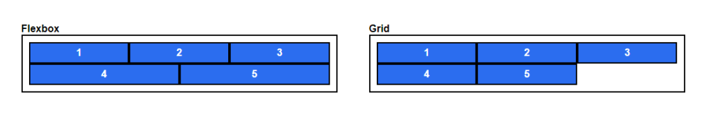
To better understand this, have a look at the following example. We will distribute five elements over two columns, first with Flexbox and then with CSS Grid.
Because of the flexible behavior of Flexbox (left), the first three span the first row, and the other two go into the next line. Both of them take as much space up as possible! Thus they do not align with the elements in the first row.
Instead, for CSS Grid, you define three columns, and the elements use cells aligning to these columns. That means that they align perfectly.
If this guide is helpful to you and you like what I do, please support me with a coffee!
But be careful not to fall into the trap of thinking that you strictly have to use Flexbox in one-dimensional scenarios and CSS Grid in two-dimensional ones. That is not the case! You can also build two-dimensional layouts with Flexbox. For example, Bootstrap 4 is based on that concept. Additionally, you can also use CSS Grid for one-dimensional tasks.
When to use Flexbox? (Examples)
In the first example, we will recreate the first example shown above. We first set the grow, shrink, and the basis property of the flex items and then add them to a container. To understand what these properties do checkout my interactive post on Flexbox here:
<style>
.content-flow-1 {
    display: flex;
    flex-direction: row;
    flex-wrap: wrap;

    width: 500px;
}

.flex-1 {
    flex: 1 1 150px;
}
</style>

<div class="visual-container">
    <div class="content-flow-1 container">
        <div class="item flex-1">1</div>
        <div class="item flex-1">2</div>
        <div class="item flex-1">3</div>
        <div class="item flex-1">4</div>
        <div class="item flex-1">5</div>
    </div>
</div>In the next example, we use Flexbox to create a navigation bar. This is a common task for Flexbox because the navigation bar fills up dynamically, and Flexbox can control the content flow. In the navbar, you can move the logo to the left by using margin-right: auto; and then you align all other items to the right:
<style>
.navbar {
    display: flex;
    align-items: center;
    justify-content: flex-end;
}

.logo-element {
    margin-right: auto;
}
</style>

<header class="navbar">
    <div class="logo-element"></div>
    <div class="nav-item">Home</div>
    <div class="nav-item">Blog</div>
    <div class="nav-item">About</div>
</header>When to use CSS Grid? (Examples)
For the first CSS Grid example, we will recreate the previously shown example to show how the precise placement of elements inside the grid works. Therefore we have to define the grid behavior in the Grid Container first (to better understand the properties check out my interactive post on CSS Grid here):
<style>
.content-precise-1 {
    display: grid;
    grid-template-columns: repeat(3, 1fr);
    grid-template-rows: auto;
    width: 500px;
}
</style>

<div class="visual-container">
    <div class="content-precise-1 container">
        <div class="item">1</div>
        <div class="item">2</div>
        <div class="item">3</div>
        <div class="item">4</div>
        <div class="item">5</div>
    </div>
</div>Next, we will show the strengths of the CSS Grid by creating a page layout with two dimensions. As an example, we will use the holy-grail layout; if you do not know it, you can read more about it here. To build it out, we will use the grid-areas property of the CSS Grid. With it, we can define grid areas and where they should be placed in the grid:
<style>
.holy-grail {
    grid-template-areas:
        "top top top"
        "left center right"
        "bottom bottom bottom";
}
</style>

<div class="holy-grail container">
    <div class="item" style="grid-area: left;">Menu</div>
    <div class="item" style="grid-area: right;">Ad</div>
    <div class="item" style="grid-area: top;">Header</div>
    <div class="item" style="grid-area: bottom;">Footer</div>
    <div class="item" style="grid-area: center;">Content<br>Content</div>
</div>Content
When to combine CSS Grid and Flexbox?
One important thing to understand is that it is not one or the other; you can also combine both of them! In the following example, we will build a grid with card items. Then, some of the content (the meta-information) inside the card items is laid out with Flexbox.
<style>
.content-grid {
    display: grid;
    grid-template-columns: repeat(3, 1fr);
    width: 500px;

    gap: 1em;
}

.meta {
    display: flex;
    flex-direction: row;
    justify-content: space-between;
}
</style>

<div class="content-grid container">
    <div class="card">
        <div class="card-image"></div>
        <div class="meta">
            <div class="tags">Tags</div>
            <div class="date">November 20, 2021</div>
        </div>
        <div class="card-title">
            Title 1
        </div>
        <div class="card-description">
            This is the description for this card!
        </div>
    </div>
    ...
</div>Conclusion
In this post, we discussed CSS Grid vs Flexbox by first explaining the differences and then showing working examples for both. As a little helper, you can remember the following table:
| Property | Grid | Flexbox |
|---|---|---|
| Dimension | 2D | 1D |
| Features | Focuses on the content placement and allows for precise layouts | Focuses on the content flow |
| When to use | Full page layouts and when you need precise content placement | When the content is more important than the precise placement |
I hope you enjoyed and learned something new in this post. If you are interested in more web development-related content, subscribe to my newsletter!
[convertkit form=2303042]
Discussion (0)
Related Posts