Create a filterable gallery for your portfolio
You have created your first portfolio and want to extend it with a filterable gallery to display your work? You can create an easy and intuitive gallery by utilizing HTML, CSS, and some JS.
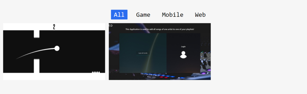
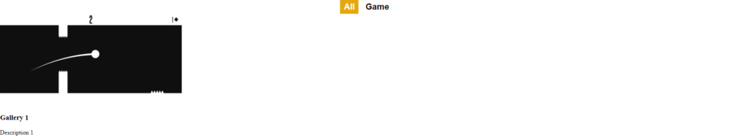
Maybe you have seen the result of this post on my landing page already. If not this image shows how the final result might look like.
So let us create a nice gallery for your portfolio!
Steps
To create a filterable gallery we have to first create the general structure, style it, and then give it some functionality. We will also add responsiveness to make it look good on mobile as well.
- Set up the file and folder structure
- Build the gallery for desktop
- Make the filterable gallery responsive
Set up the file and folder structure
First, we will create multiple files that we store in separate folders to give the project some structure. We will create the folders for css containing gallery.css, js containing gallery.js, and img containing the image.png.
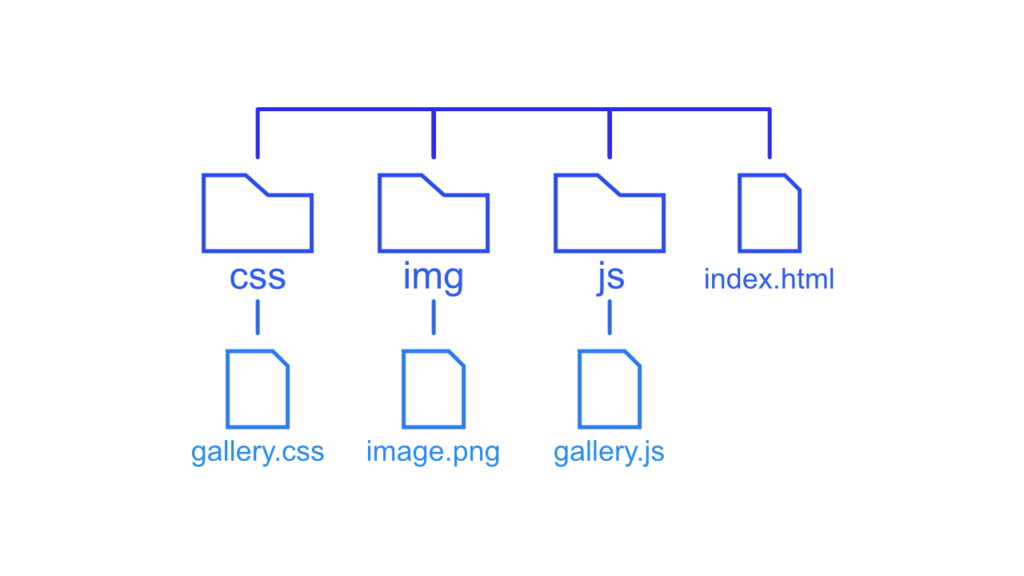
Additionally, we will add a index.html file in the root directory. This file contains all the HTML needed for the filterable gallery. In the file, we will also import the gallery.css and gallery.js to add styles and functionality. The file is supposed to have the following content:
<!DOCTYPE html>
<html lang="en">
<head>
    <meta charset="UTF-8">
    <meta http-equiv="X-UA-Compatible" content="IE=edge">
    <meta name="viewport" content="width=device-width, initial-scale=1.0">
    <title>Gallery Demo</title>
    <!-- import stylesheet -->
    <link rel="stylesheet" href="css/gallery.css">
</head>
<body>
    <!-- import javascript -->
    <script src="js/gallery.js"></script>
</body>
</html>
[convertkit form=2634876]
If this guide is helpful to you and you like what I do, please support me with a coffee!
Build the gallery for desktop
The next step to create the gallery layout is to define the basic HTML structure. This will include a list of buttons for the different categories to filter by and a list of images to filter for. The first step will be to create and category and one gallery element to style the look of the gallery. Afterwards, we will create multiple elements to add functionality and responsiveness.
<div id="categories">
    <button class="category active">All</button>
    <button class="category">Game</button>
</div>

<div class="gallery-elements">
    <div class="gallery-element">
        <img class="image" src="img/image.png" alt="">
        <div class="description">
            <h3 class="title">Gallery 1</h3>
            <p class="subtitle">
                Description 1
            </p>
        </div>
    </div>
</div>
As you can see in the HTML we assigned multiple classes to the different tags to style the elements the way we want. All classes are used to style the basic appearance of the elements. The only special one, for now, is the class “active”, which will indicate what category is filtered for at the moment. I also said that we will create one specific category, and we did, the category “all” is to remove all filters and display every element in the gallery.
Style the category section
Now we will start with the styling of the category section. We want a row containg all categories as buttons with a clean and minimal style.
body {
    font-family: sans-serif;
}

#categories {
    display: flex;
    justify-content: center;
}

.category {
    font-weight: bold;
    font-size: 22px;
    margin: 0 4px;
    padding: 5px 10px;
    border: none;
    background-color: transparent;
    cursor: pointer;
}

.category:hover {
    color: white;
    background-color: rgb(228, 168, 15);
}

.category.active {
    color: white;
    background-color: rgb(228, 168, 15);
}
With this in place, we have a nicely styled category section containing buttons with a basic, hover, and active styling. Additionally, we have an unproportional image that will be styled in the next section.

Style the gallery
To style the gallery nicely we first add a grid with four columns to the gallery elements. After that, we will style the elements themselves.
.gallery-elements {
    display: grid;
    grid-template-columns: repeat(4, .25fr);
    grid-column-gap: 5px;
    grid-row-gap: 5px;
}

.gallery-element {
    position: relative;
    width: 100%;
}

.gallery-image {
    width: 100%;
}
By choosing the four-column layout we defined the size of the gallery elements because the maximum width of every element is the width of one column.
Additionally, I would like to move the description on top of the image and display it in a white color.
.description {
    position: absolute;
    width: 90%;
    height: 100%;
    top: 0;

    display: flex;
    flex-direction: column;
    justify-content: center;

    color: aliceblue;
    padding: 0 5%;
}

.title {
    font-weight: bold;
}

.subtitle {
    margin-top: 0;
}
With these changes, it looks way better doesn’t it?
Add filtering
Now that we finished the visuals we will add the filtering functionality. To accomplish this we will have to add classes to the gallery elements and also add one property to the gallery-element itself. Additionally, we will create four different functions to filter the elements by changing classes on button click.
Let’s start with the CSS changes. First, we will hide the gallery elements with the display: none property. With this the gallery element will be hidden, to show it again we create a new class called show containing the property display: block. With the help o the javascript functions we can add the class to the selected element.
.gallery-element {
    position: relative;
    width: 100%;
    display: none;
}

.show {
    display: block;
}
To tell the functions what gallery elements they have to show, we will add classes with the names of the categories to the element (i.e. add the game category to the current element).
<div class="gallery-element game">
    <img class="gallery-image" src="img/image.png" alt="">
    <div class="description">
        <h3 class="title">Gallery 1</h3>
        <p class="subtitle">
            Description 1
        </p>
    </div>
</div>
Now that we added the classes to the gallery element we will create the functionality to filter for it. I would suggest creating some more gallery elements and some more categories to see the effect better.
We will add two helper functions to add and remove classes from the HTML tags.
// add show to the elements that are selected
function addClass(element, name) {
  var i, classArr, nameArr;
  classArr = element.className.split(" ");
  nameArr = name.split(" ");
  for (i = 0; i < nameArr.length; i++) {
    if (classArr.indexOf(nameArr[i]) == -1) {
      element.className += " " + nameArr[i];
    }
  }
}

// remove show from elements that are not selected
function removeClass(element, name) {
  var i, classArr, nameArr;
  classArr = element.className.split(" ");
  nameArr = name.split(" ");
  for (i = 0; i < nameArr.length; i++) {
    while (classArr.indexOf(nameArr[i]) > -1) {
      classArr.splice(classArr.indexOf(nameArr[i]), 1);
    }
  }
  element.className = classArr.join(" ");
}
With the help of these two functions, we can handle the classes on the category buttons and gallery elements. With the next function, we will filter the elements by the clicked category. To accomplish this we will first get all gallery elements and then see if they contain the class of the category we filter for. If they contain the category we add the show class, if not it will be removed.
filterSelection("all") // execute the function and show all columns
function filterSelection(c) {
    console.log(c)
    var x, i;
    x = document.getElementsByClassName("gallery-element");
    if (c == "all") c = "";
    // add the "show" class (display:block) to the filtered elements, and remove the "show" class from the elements that are not selected
    for (i = 0; i < x.length; i++) {
        removeClass(x[i], "show");
        if (x[i].className.indexOf(c) > -1) addClass(x[i], "show");
    }
}
Now there are only two steps left to finish the filtering functionality. The first thing is that we have to execute the functions on a button click. We will do this by calling the filterSelection with the help of the onclick event.
<div id="categories">
    <button class="category active" onclick="filterSelection('all')">All</button>
    <button class="category" onclick="filterSelection('game')">Game</button>
</div>
The last thing is to highlight the currently selected category. To do this we just have to move the active class from one category button to another.
// add active to the current button (highlight it)
var btnContainer = document.getElementById("categories");
if(btnContainer != undefined) {
var btns = btnContainer.getElementsByClassName("category");
for (var i = 0; i < btns.length; i++) {
btns[i].addEventListener("click", function(){
var current = document.getElementsByClassName("active");
current[0].className = current[0].className.replace(" active", "");
this.className += " active";
});
}
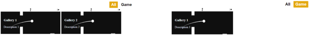
}After adding another gallery element without a category we get the following result after selecting the game category:
Add a hover effect
Now that we have added the filtering for the gallery elements we are basically done. But I still want to give it a cool hover effect and also make the gallery responsive. So let’s get started with the hover effect!
The hover effect will contain two classes. One that hides the text in the beginning and one that shows it on hover.
.hide-element {
    opacity: 0;
    transition: all 0.2s ease-in-out;
}

.show-hidden:hover .hide-element {
    opacity: 1;
    transition: all 0.2s ease-in-out;
}
We have to now add these classes to the gallery elements like this.
<!-- add the show-hidden class -->
<div class="gallery-element show-hidden game">
    <img class="gallery-image" src="img/image.png" alt="">
        <!-- add the hide-element class -->
    <div class="description hide-element">
        <h3 class="title">Gallery 1</h3>
        <p class="subtitle">
            Description 1
        </p>
    </div>
</div>
With this in place, we have a nice hover effect to display the description of the chosen element.
Make the filterable gallery responsive
To make the filterable gallery responsive we have to go through three steps. The first step is changing the grid layout accompanied by the second step of lowering the font size for smaller devices. The third step on the other hand is to remove the hover effect on devices that do not have a hover capability.
In the first step we define different grid behaviours for the different devices like this:
/* Landscape phone to portrait tablet */
@media (max-width: 767px) {
    .gallery-elements {
        grid-template-columns: repeat(3, .33fr);
    }
}

/* Landscape phones and down */
@media (max-width: 480px) {
    .gallery-elements {
        grid-template-columns: repeat(2, .5fr);
    }
}
In the second step we first define a default font size and then add media querys for smaller devices.
html {
    font-size: 20px;
}

@media screen and (max-width: 1680px) {
    html {
        font-size: 18px;
    }
}

@media screen and (max-width: 736px) {
    html {
        font-size: 16px;
    }
}

@media screen and (max-width: 360px) {
    html {
        font-size: 14px;
    }
}
Lastly will remove the hover effect for devices without the hover capabilities:
@media (hover: none) {
    .hide-element {
        opacity: 1;
        transition: all 0.2s ease-in-out;
    }

    .show-hidden:hover .hide-element {
        opacity: 1;
        transition: all 0.2s ease-in-out;
    }
}
With these style settings, we now have a fully responsive filterable gallery to display our portfolio.

I hope this guide was helpful. If you have any feedback or questions just leave a comment or send me an email at mail@programonaut.com.
You can also find this project on my GitHub and start from there.
Discussion (2)
Related Posts