How to make a sticky and responsive navbar
Do you want to make your website more responsive? In this post, I want to show you how I created my sticky and responsive navbar that also includes a logo and a burger menu for mobile users.
Lets make your responsive navbar!
Steps
This process is pretty straightforward. All we need is HTML for the structure, CSS for the style, and JavaScript for the burger menu.
Set up the file and folder structure
Firstly we will create multiple files and store them in separate folders to make the system more extensible later on. We will create the folders for css containing navbar.css, js containing navbar.js, and img containing the logo.png.
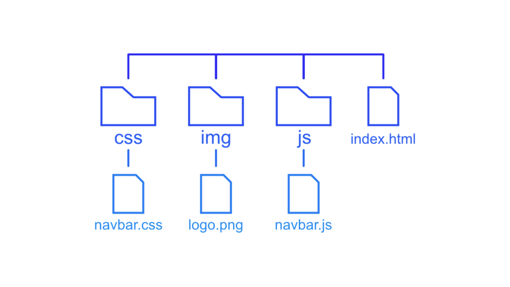
Additionally, we will add a index.html file in the root directory. This file contains all the HTML needed for the navigation bar. In the file, we will also import the navbar.css and navbar.js to add styles and functionality. The file is supposed to have the following content.
<!DOCTYPE html>
<html lang="en">
<head>
    <meta charset="UTF-8">
    <meta http-equiv="X-UA-Compatible" content="IE=edge">
    <meta name="viewport" content="width=device-width, initial-scale=1.0">
    <title>Navbar Demo</title>
    <!-- import stylesheet -->
    <link rel="stylesheet" href="css/navbar.css">
</head>
<body>
    <!-- import javascript -->
    <script src="js/navbar.js"></script>
</body>
</html>
[convertkit form=2634876]
Build the desktop layout
Secondly, we will build the basic navbar for the desktop view. It will be sticky and contain a menu as well as a logo. But before we start with the navbar itself we will add some general styles for the body and the anchor tags.
If this guide is helpful to you and you like what I do, please support me with a coffee!
/* navbar.css */
body {
    margin: 0;
    /* to see that the navbar is sticky */
    height: 200vh;
    background: rgb(2,0,36);
    background: linear-gradient(0deg, rgba(2,0,36,1) 0%, rgba(9,9,121,1) 50%, rgba(0,104,255,1) 100%);
}

a {
    color: black;
    text-decoration: none;
    font: bold 22px sans-serif;
}

a:hover {
    color: darkcyan;
}
With that out of the way we should see a big gradient over the screen and we can start to create the navbar itself. Therefore we will use a nav tag surrounding an image container and an unordered list for the navigation menu. The tags attached to the classes will help us define the style of the navbar.
/* index.html */
<nav class="navbar">
<div class="logo-container">
<img class="logo-image" src="img/logo.png" alt="logo">
</div>
<ul class="nav-menu">
<li class="menu-item">
<a href="http://" target="_blank" rel="noopener noreferrer">Home</a>
</li>
<li class="menu-item">
<a href="http://" target="_blank" rel="noopener noreferrer">Blog</a>
</li>
</ul>
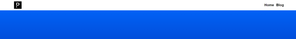
</nav>For the moment we have a plain navbar looking like this:

With the following CSS, we will make the navbar look a lot better and also already apply the sticky behavior. To do this we just have to add position: sticky as well as position: -webkit-sticky for Safari. Additionally, we will use flexbox to convert our navbar to a row and space the menu and the logo as far apart as possible. We can achieve this by applying the space-between property.
.navbar {
    /* make it stick */
    position: sticky;
    position: -webkit-sticky;
    top: 0;
    /* in front of all other elements */
    z-index: 99;
    /* set background */
    background-color: white;
    padding: 10px 5%;

    /* define flex */
    display: flex;
    justify-content: space-between;
    align-items: center;
}

.logo-image {
    display: block;
    height: 48px
}

.nav-menu {
    margin: 0;
    padding: 0;
    list-style-type: none;
    list-style-image: none;
}

.menu-item {
    display: inline-block;
    margin-left: 10px;
}
After we applied these styles our navbar looks way better, dont you agree?
With this the layout for the desktop view is finished.
Make the navbar responsive
Lastly, we add the menu icon and shift the layout for the mobile view. With the media query, we can apply these changes for the mobile view only. The first step is to add the menu icon to the HTML, by creating 3 separate Bars that combined result in a burger menu.
<nav class="navbar">
    .
    .
    .
    <div class="menu-icon">
        <div class="bar"></div>
        <div class="bar"></div>
        <div class="bar"></div>
    </div>
</nav>
For now, we see nothing. With the following CSS, we will define the bars building up the menu icon.
.bar {
    width: 20px;
    height: 3px;
    background-color: black;
    margin: 4px auto;
}
This gives a pretty nice result that you can see in the next picture.
But for now we will hide it, because we only need it in the mobile view.
.menu-icon {
    display: none;
}
Now we can define the layout shift for the mobile version. We only want to apply it if the screen width is smaller than 600px so we can be sure that it is not a desktop view. To convert the navigation bar into a vertical layout we change the flex-direction of our navbar class from row to column. Additionally, we will give the logo the complete width, to make sure the menu moves into the next row. We also want to place the menu icon in the same row as the logo, so we will apply an absolute position to it and move it to the top right of the screen.
@media only screen and (max-width: 600px) {
    .navbar {
        flex-direction: column;
    }

    .logo-container {
        width: 100%;
    }

    .nav-menu {
        width: 100%;
    }

    .menu-item {
        display: block;
        width: 100%;
        padding: 5px 0;
        text-align: end;
    }

    .menu-icon {
        display: block;
        position: absolute;
        top: 20px;
        right: 5%;
    }

    .menu-icon:hover .bar {
        background-color: darkcyan;
    }
}
As you can see we now basically have an openen vertical navigation menu for mobile.

Because of this, our last step is to hide the navigation menu and add the ability to toggle it by clicking on the menu icon. We can achieve this by using 3 lines of JS and some CSS. For the CSS we will first add a display: none to the nav-menu class inside of the media query to hide the menu. On the other hand, we need another class called active containing the attribute display: block to toggle the menu with the toggle function.
.nav-menu {
    display: none;
    width: 100%;
}

.active {
    display: block;
}
To apply the JavaScript function, we need to add ids to some of the HTML elements. First, we will add the nav-list id to the unordered list and then we add the nav-toggle id to the menu icon.
<ul id="nav-list" class="nav-menu">
    <li class="menu-item">
        <a href="http://" target="_blank" rel="noopener noreferrer">Home</a>
    </li>
    <li class="menu-item">
        <a href="http://" target="_blank" rel="noopener noreferrer">Blog</a>
    </li>
</ul>
<div id="nav-toggle" class="menu-icon">
    <div class="bar"></div>
    <div class="bar"></div>
    <div class="bar"></div>
</div>
With the ids in place, we can reference them and add the function to the on-click event of the menu icon. In the function, we just toggle to active class on the nav-menu to switch between display: none and display: block.
var tglbtn = document.getElementById("nav-toggle");
var navlst = document.getElementById("nav-list")

tglbtn.addEventListener('click', () => {navlst.classList.toggle("active");});
With this function we can toggle the menu by clicking on the burger menu and we get following result:

I hope this guide was helpful! As an idea, you could implement this navbar in the blog created with Svelte from this other post I made some weeks ago!
If you have any questions or feedback feel free to write a comment or sent me an email at mail@programonautonaut.com. Additionally, you can find the files for this project on GitHub.
Discussion (0)
Related Posts