How to Create a Fixed Navbar with Tailwind CSS
Do you want to utilize Tailwind CSS to create a fixed navbar that sticks to the top of your page when you scroll? In this post, we will create that and also take care of responsiveness for mobile!
In the last weeks, I started dabbling around with Tailwind CSS for the first time, and I have to say that I love it so far. One post I created a while ago was how to create a sticky and responsive navbar with basic CSS (you can find it here). Thus I thought it would be nice to create something similar with tailwind and see the differences!
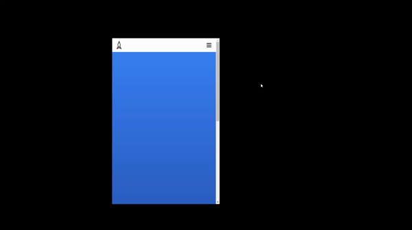
So let’s start creating the navbar that you can see in the following gif:
Project preparation
For this project, we will use vite to launch our dev server and tailwind as a CSS framework. To get started, we will initialize a new vite project and install the required dependencies for a fluent development environment.
First, we will create a new vite project by running:
npm init vite navbar-twIn the next step, we select ‘vanilla’ as our framework and press enter to continue. From there, you can choose either to use vanilla javascript or typescript. We will use basic javascript for this guide, so select vanilla again.
Now you can enter the directory and install the required packages:
If this guide is helpful to you and you like what I do, please support me with a coffee!
cd navbar-tw
npm install
With that, we installed vite and have the ability to see changes applied in realtime after we started the dev server. But before we do that, let’s install tailwind. In addition to tailwind, we will also install postcss for easier development:
npm install -D tailwindcss postcss autoprefixerAnd then, we create config files for the different components:
npx tailwindcss init -pInside the newly created tailwind.config.js file, we will edit the contents part as follows:
module.exports = {
  content: [
    "./index.html"
  ],
  theme: {
    extend: {},
  },
  plugins: [],
}
The last step in setting up tailwind is to update the style.css file as follows:
@tailwind base;
@tailwind components;
@tailwind utilities;
Now that we have set up vite and tailwind, we can start our development server with:
npm run devBefore we go ahead and build our fixed navbar, let’s clean up some vite created files first. Remove the contents in main.js and update the index.html as follows:
<!DOCTYPE html>
<html lang="en">
  <head>
    <meta charset="UTF-8" />
    <link rel="icon" type="image/svg+xml" href="favicon.svg" />
    <meta name="viewport" content="width=device-width, initial-scale=1.0" />
    <title>Tailwind Navbar</title>
    <link rel="stylesheet" href="style.css">
  </head>
  <body class="bg-gradient-to-t from-blue-900 to-blue-500 h-[200vh]">

    <script src="/main.js"></script>
  </body>
</html>
This creates a blue gradient with the height of two times your screen. We generate this background to visualize the sticky scroll effect.
Creating a fixed navbar for mobile
One principle of building with Tailwind CSS is that it uses a Mobile-First Breakpoint System, meaning unprefixed classes will apply on all screens, and prefixed classes will apply after the defined breakpoint. Therefore we will create the mobile layout first and then create the desktop version.
The first step for us is to define a header including an image (therefore create an image called avatar.png) and a container including the menu icon and the menu elements (in this case, a div):
<header>
  <div id="img-container">
    <img src="avatar.png" alt="avatar">
  </div>

  <div id="nav-container">
    <div id="nav-icon">
      <svg xmlns="<http://www.w3.org/2000/svg>" viewBox="0 0 20 20" fill="currentColor">
        <path fill-rule="evenodd" d="M3 5a1 1 0 011-1h12a1 1 0 110 2H4a1 1 0 01-1-1zM3 10a1 1 0 011-1h12a1 1 0 110 2H4a1 1 0 01-1-1zM3 15a1 1 0 011-1h12a1 1 0 110 2H4a1 1 0 01-1-1z" clip-rule="evenodd" />
      </svg>
    </div>

    <ul id="nav-menu">
      <li>Menu Item</li>
      <li>Menu Item</li>
      <li>Menu Item</li>
    </ul>
  </div>
</header>
Now we will style all these elements with Tailwind CSS Classes. First is the header. We want it to have a specific height, stick to the top, and have a white background. So let’s create that.
<header class="h-16 bg-white sticky top-0">
	<!-- ... -->
</header>
We now have a bar that sticks to the top, but the other elements are too big or in the wrong place, so let’s continue with the image. We want it inside of the header on the left side. Therefore we change the classes like this:
<div id="img-container" class="absolute left-2 top-2 h-12 w-12">
    <img src="avatar.png" alt="avatar" class="h-full w-full">
</div>
And then we do the same with the navbar icon, just on the right. In addition to that, we also want the menu items below the icon. For that, we need to update the classes like this:
<div id="nav-container" class="bg-white p-2 flex flex-col items-end">
  <div id="nav-icon" class="h-12 w-12 p-2 group">
    <svg xmlns="<http://www.w3.org/2000/svg>" viewBox="0 0 20 20" fill="currentColor" class="h-full w-full group-hover:fill-blue-500">
      <path fill-rule="evenodd" d="M3 5a1 1 0 011-1h12a1 1 0 110 2H4a1 1 0 01-1-1zM3 10a1 1 0 011-1h12a1 1 0 110 2H4a1 1 0 01-1-1zM3 15a1 1 0 011-1h12a1 1 0 110 2H4a1 1 0 01-1-1z" clip-rule="evenodd" />
    </svg>
  </div>

  <ul id="nav-menu" class="w-full space-y-2 pr-3 font-semibold text-xl text-right">
    <li>Menu Item</li>
    <li>Menu Item</li>
    <li>Menu Item</li>
  </ul>
</div>
One thing to note is the group class. It allows us to color the child element (in this case, the SVG) on hover of the group element. This is a handy method added by tailwind!
With these classes in place, we have the foundation for our mobile navbar:
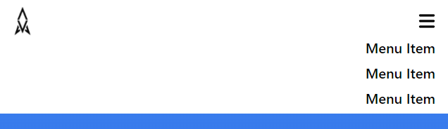
Everything looks nice and expected, but we cannot open and close the navigation yet. So let’s add that in the next step. Therefore we first add the hidden group to the “nav-menu” element (doing that will hide the menu items).
<ul id="nav-menu" class="hidden w-full space-y-2 pr-3 font-semibold text-xl text-right">
	...
</ul>
To show it again, we will create a function that gets executed when we click on the nav-icon.
For that, we will add the following lines to the main.js:
document.getElementById("nav-icon").addEventListener('click',
  () => document.getElementById("nav-menu").classList.toggle("hidden")
);
With that in place, we can now open and close the navigation menu. As a result, we have a working navigation bar for mobile!
Creating a fixed navbar for desktops
To make the navbar responsive and look good on desktops, we also need to change the styles on certain breakpoints. In the next steps, we need to update the navigation icon and the navigation menu.
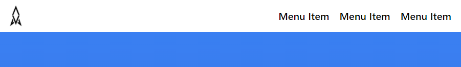
Let’s start by hiding the navigation icon because we do not need it on desktop devices:
<div id="nav-icon" class="h-12 w-12 p-2 group md:hidden">
  ...
</div>
And then, we add the following classes on desktop to make the menu items appear in a row and with some spacing:
<ul id="nav-menu" class="hidden w-full space-y-2 pr-3 font-semibold text-xl text-right md:h-12 md:flex md:flex-row md:items-center md:justify-end md:space-x-5 md:space-y-0">
	...
</ul>
This results in the following outcome:
Some customizations for the fixed navbar
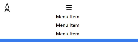
Move the Navigation Icon
To move the navigation icon, you have to edit the navigation container. In the container, you have to change the items-[…] class to fit the style you want. For example, you can move it to the center like this:
<div id="nav-container" class="bg-white p-2 flex flex-col items-center md:flex-row">
	...
</div>
Resulting in this:

Move the Menu Items
You can also move the menu items by updating the text-[…] class. For example, you can center the menu items like this:
<ul id="nav-menu" class="hidden w-full space-y-2 pr-3 font-semibold text-xl text-center md:h-12 md:flex md:flex-row md:items-center md:justify-end md:space-x-5 md:space-y-0">
	...
</ul>
Resulting in this:
Create a hover effect for the menu items
You can add a hover effect to the menu items by adding the following class to the list items:
<li class="hover:text-blue-500">Menu Item</li>Resulting in this hover effect:

Conclusion
In this post, we learned how to create a fixed navbar with tailwind CSS. In addition, to stick to the top, it is also responsive and easily editable for your preferences. You can find the source code for this project in a GitHub repository here. In case you have any questions, feel free to leave a comment or send me an email at mail@progromanaut.com.
If you liked this post, consider subscribing to my newsletter to get updates on new web development-oriented content!
[convertkit form=2303042]
Discussion (0)
Related Posts