CSS Animations: Learn how to create cool animations quickly
Are you interested in learning how to animate different elements with CSS Animations? We will now look at two different ways to go about that. These are keyframe animations as well as transitions!
What are CSS Animations?
CSS Animations let you change the style of an element over time. Every animation consists of multiple keyframes. Each keyframe then holds the element’s style at a specific point in time. The animation then gradually changes from one keyframe to the other, which means that color does not just switch from start to end state but uses other values in between, to have a smooth transition.
For example, if I want to linearly change my color from white (#FFFFFF) at 0 seconds to black (#000000) at 4 seconds, the color of the element would be gray (#808080) at 2 seconds.
Important to note is that there are Keyframe Animations and Animations that you can create by using the transition keyword. Transition Animations can only consist of two-state, a start, and an end state. They work similar to a keyframe animation with only two states but are easier to define.
Both have their place. For example, you can use the transition keyword more effectively for a hover animation. But keyframes work better for more complicated animations (more complicated means more than two states, repeating animation, etc.). So it’s good to know about both, to use them appropriately.
How to create CSS Animations with Keyframes
After having the basics let us create an animation for a button when we hover over it, in this example, we want to change to corner radius and the button’s color over 1 second.
This is our buttons CSS code:
If this guide is helpful to you and you like what I do, please support me with a coffee!
button {
    width: 200px;
    height: 50px;
    background-color: #0c99f7;
    color: white;
    border-radius: 25px;
    border: none;
    font-weight: bold;
}

button:hover {
    background-color: #0c6af7;
    border-radius: 5px;
}
As you can see at the moment, we change the color of the button without an animation, only with the hover state, so let’s get that right.
Therefore we have to create two keyframes. The first one by using 0% or from, holding the start state, and the second one by using 100% or to holding the end state. We also create an animation that will be played when we leave the hover state called hover-out. Additionally, we have to update the button style and the hover state style to use the animations:
@keyframes hover-in {
    0% {
        background-color: #0c99f7;
        border-radius: 25px;
    }
    100% {
        background-color: #0c6af7;
        border-radius: 5px;
    }
}

@keyframes hover-out {
    0% {
        background-color: #0c6af7;
        border-radius: 5px;
    }
    100% {
        background-color: #0c99f7;
        border-radius: 25px;
    }
}

button {
    width: 200px;
    height: 50px;
    background-color: #0c99f7;
    color: white;
    border-radius: 25px;
    border: none;
    font-weight: bold;
    animation-name: hover-out;
    animation-duration: 1s;
}

button:hover {
    animation-name: hover-in;
    animation-duration: 1s;
    animation-fill-mode: forwards;
}
The result is a button that changes the corner radius and the color when we hover on top of it. Try it out:
The most important CSS Animation properties for Keyframes
Now that we have learned how to create an animation let’s look at the different properties that we can use. We have already learned about the keywords directive and the properties animation-name and animation-duration.
Let’s begin with a closer look at keywords. Inside of @keywords you can either use the from and to, if there are only supposed to be two states, or the state percentage if more are needed. That would look like this for a color-changing animation:
/* with 2 states*/
@keyframes color-change {
    from { background-color: yellow; }
    to   { background-color: turquoise; }
}

/* with 3 states*/
@keyframes color-change {
    0%   { background-color: yellow; }
    50%  { background-color: lightgreen; }
    100% { background-color: turquoise; }
}
Then inside of the element’s style you want to change, you have these property options.
animation-delay: xs;delays the animation by x secondsanimation-iteration-count: x;runs the animation x times (useinfiniteto run the animation for everanimation-direction: option;specifies the direction the animation is playednormal: animation is played forward (default)reverse: animation is played backward,alternate: the animation is played forward and then backward (needs at least 2 iterations)alternate-reverse: the animation is played backward and then forward (needs at least 2 iterations)
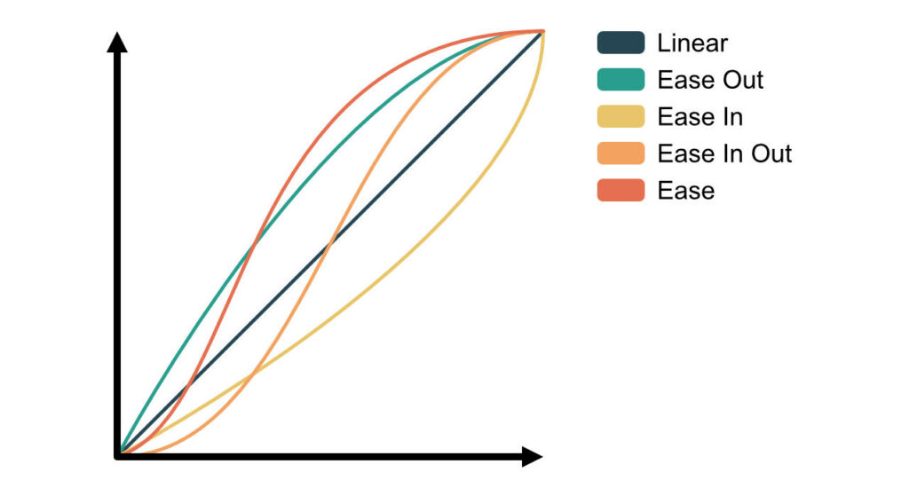
animation-timing-function: option;specifies the speed curve of the animationeaselinearease-inease-outease-in-outcubic-bezier(n,n,n,n)– define your own curve
animation-fill-mode: option;to specify if the animation should change the style of the propertynone: won’t apply any styleforwards: applies style of the last keyframe (depends on animation-direction and animation-iteration-count)backwards: applies style of the first keyframe (depends on animation-direction)both: apply rules for both forwards and backwards
animation: <name> <duration> <speed-curve> <delay> <iterations> <direction>;as a short hand for all properties
Some tricks
Stop animation on page load
One thing you might have recognized is that the hover-out animation plays immediately when the page is loaded. To prevent animations on page load, I found this trick on StackOverflow.
First, we add a class preload to the body tag of the HTML.
<body class="preload">
...
</body>
Then we create the preload class in the CSS:
body.preload *{
    animation-duration: 0s !important;
    -webkit-animation-duration: 0s !important;
}
And remove it after the longest animation duration (in our case 1 sec) by using JavaScript:
const durationInMS = 1000;
setTimeout(function(){
    document.body.className="";
}, durationInMS);
If you do not understand this last section yet, check out this post on JavaScript callbacks here.
How to create CSS Animations with Transition
Now that we have seen CSS keyframe animations, let’s look at animations with the transition keyword. In this example, we will recreate the same hover effect as before to see the benefits of using this technique.
button {
    width: 200px;
    height: 50px;
    background-color: #0c99f7;
    color: white;
    border-radius: 25px;
    border: none;
    font-weight: bold;
    transition: all 1s ease;
}

button:hover {
    background-color: #0c6af7;
    border-radius: 5px;
}
The transition property will update all changes in 1s with an eased speed curve. You can see the result here:
As you can see, the result is working faster and better. Better because if I leave the button before the transition ends, it will not snap to a certain value as it does with keyframes.
But to be fair, transition animations are not usable for complex stuff. The best use cases are state changes of various elements because you cant play the transition back otherwise.
The most important CSS Animation properties for Transitions
The transition property that we used in the example above is a shorthand for the following properties:
transition-property: css-property;used to define the css properties that should be updated with an transition (e.g.height: will only watch the height property,color: will only watch the color property andall: will watch all properties)transition-duration: xs;defines the duration of the transition in x secondstransition-timing-function: option;to set the speed-curve of the transitioneaselinearease-inease-outease-in-outcubic-bezier(n,n,n,n)– define your own curve
transition-delay: xs;to set the delay of the transition in x seconds
Conclusion
In this post, we learned about the different ways you can create CSS animations. Keyframe animations and transitions. Keyframe animations can be created by defining keyframes and using the animation keyword. On the other hand, transitions are made using the transition keyword and defining the CSS properties that it should watch.
As we’ve seen, transitions work well for hover or other state-changing effects with only two states (a start and end state). In comparison, keyframe animations are better for more complex animations (e.g., animations with more than two states, repeating animations, etc.).
Thank you for reading this post, and I hope you learned something new as I did with transitions. In case you liked it consider subscribing to my newsletter!
[convertkit form=2303042]
Discussion (0)
Related Posts